It's never been easier to hang a large screen on the shop floor and fill it with numbers. That's the problem. Most plant displays I've seen show everything the system can produce: OEE to two decimal places, a dozen charts, a scrolling list of jobs. People stop looking at them within a month.
A display on the floor is a tool, not decoration. It's useful only if the person walking past can understand it in a few seconds and knows what to do differently because of it.
Start with who's looking
Different people need different things from the same data, and a single display that tries to serve all of them serves none.
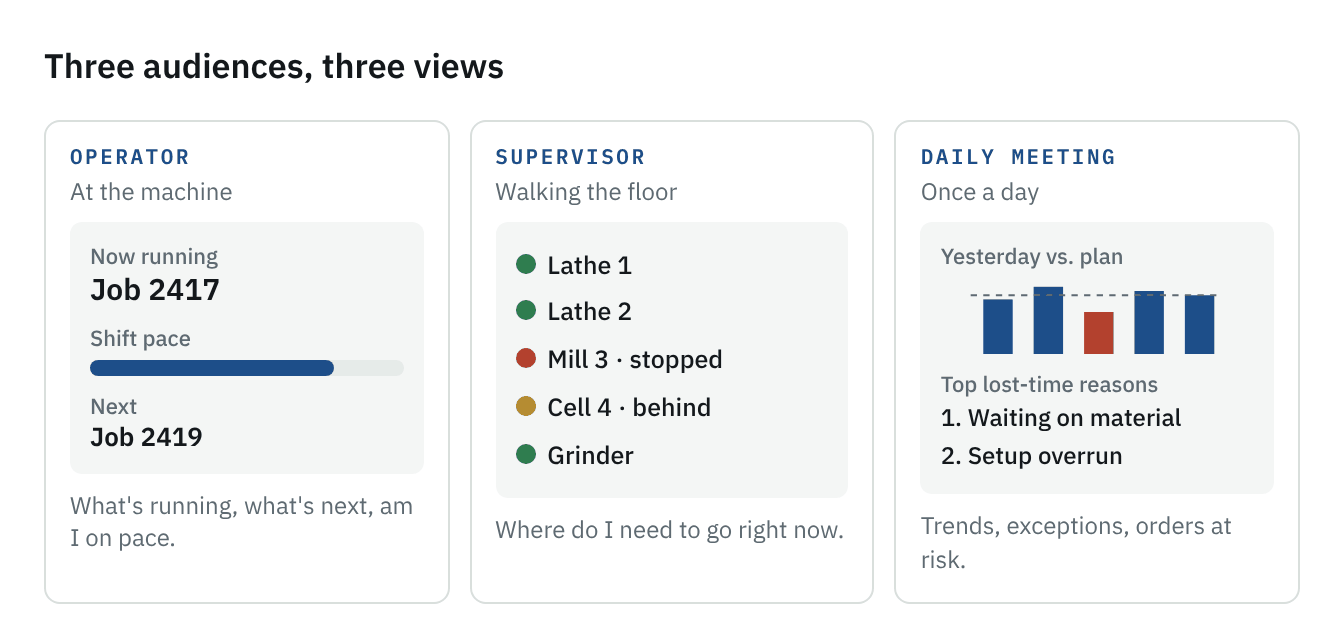
Operators at a machine need to know what's running, what's next, and whether they're on pace for the shift. Nothing more.
Supervisors and leads walking the floor need to know where to go: which machine is down, which job is behind, where help is needed right now.
Managers in the daily meeting need trends and exceptions: yesterday's performance against plan, the top reasons for lost time, the orders at risk.
Those are three different screens, or at least three different views. Mixing them is why so many displays become unreadable.
The diagram below sketches what each view might contain. Notice what each one leaves out as much as what it shows: the operator's view has no trends, the supervisor's has no history, and the meeting view has no next job. Each answers one question for one person, at a glance.
Five rules for a floor display
1. Readable from the aisle. If you have to walk up to the screen to read it, it's a report, not a display. Large text, few numbers, high contrast.
2. Status before detail. Color should answer the first question at a glance: is this running, at risk, or stopped? Detail is for the person who walks over to find out why.
3. Colors mean one thing. Green, amber and red should mean running, at risk and stopped everywhere in the plant. Not "good OEE," "medium priority," or the corporate brand color.
4. Current, or not at all. A display showing yesterday's numbers as if they were live does more harm than no display. If the data isn't captured as it happens, show it as a daily summary and label it that way.
5. Every number has an owner and an action. If nobody on the floor can do anything about a number, it doesn't belong on a floor display.
What to leave off
Some things look good in a demo and don't help on the floor.
- OEE as a single headline number. It hides more than it shows. Availability, performance and quality each point to different actions; show the one the audience can act on.
- Individual rankings. Leaderboards of operators turn a tool into a scoreboard, and people quickly learn to game it or avoid it. Coach in conversation; don't rank on a wall.
- Everything the system knows. More charts mean less attention on each.
- Data nobody trusts. If people on the floor know the numbers are wrong, the display damages the credibility of every system behind it.
The data has to be right first
A display only shows what the systems underneath it capture. If machine status depends on someone remembering to update it, or job progress is entered at the end of the shift, the display will be wrong for most of the day, and the floor will know it.
That's why I think of the display as the last step, not the first. Get operators capturing starts, stops and reasons at the machine, quickly and accurately, and a useful display almost builds itself. Start with the screen, and you end up with an expensive picture of bad data.
The test
After a display has been up for a month, stand near it for an hour and watch. Do people look at it? Do supervisors change where they walk because of what it shows? Does anyone ever say "it's wrong"?
If people walk past without glancing at it, it's showing the wrong thing. If they glance and then act, it's working. That's the only measure that matters.
Where this leads
Every piece of this, from honest planning to clean MRO data to a display worth looking at, comes back to the same foundation: good data captured at the source, by people who get something back for entering it. That's the subject of the next piece, on what an MES should do for a small plant and why ease of use decides whether it works.